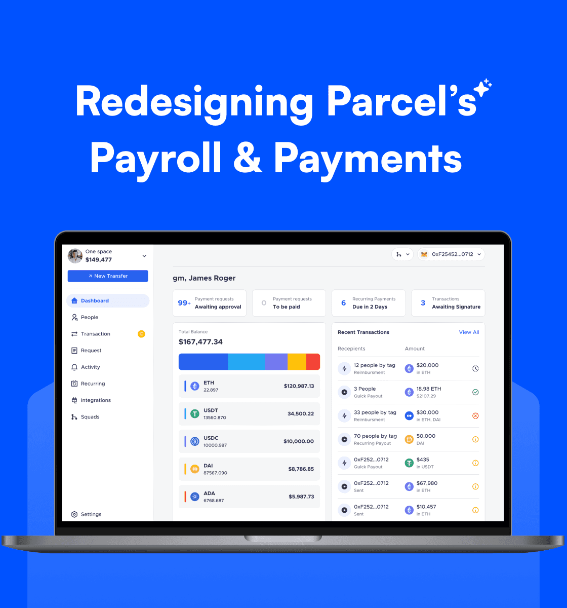
TAMM is Abu Dhabi's unified government services platform, streamlining over 900+ services for residents, citizens, and businesses. In 2024, TAMM planned a major upgrade — TAMM 3.0 — with a vision to transform user experience and introduce a conversational AI platform.
As the Senior Product Designer, I led the Design System revamp, focusing on creating scalable foundations, accessible components, and smooth collaboration for designers and developers.
With a tight timeline, the TAMM 3.0 was scheduled to launch at GITEX Global 2024 — one of the world’s largest tech events. This project received immense appreciation, including coverage by Microsoft and the Department of Government Enablement, Abu Dhabi.
Key Impact Metrics:
✔️ 80% More Consistent Designs – Standardized components across web & mobile.
✔️ 3x Faster Developer Handoff – Clear documentation & version control.
✔️ 2x Growth in Adoption – Increased usage across teams.
✔️ One-Click Dark/Light Mode – Enabled via Figma properties.
✔️ Stronger Designer-Developer Collaboration – Better workflow & reusability.
How might I rebuild TAMM’s Design System to empower product teams with scalable foundations, clear documentation, and accessible components — all within a high-pressure GITEX launch timeline?
UX Design, Design System Manager, Senior Product Designer
2-3 months
Figma, FigJam, JIRA, Microsoft Teams
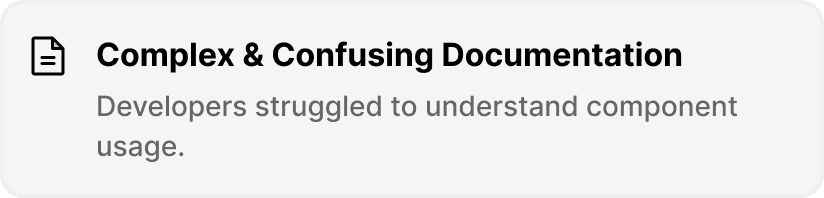
TAMM’s existing design library had major gaps — complex documentation, inconsistent components, and no proper foundation setup. This created frequent issues:
❌ Hard for developers to develop components without clarity
❌ Inconsistent padding, spacing, and styles across screens
❌ Zero support for dark/light mode adaptability
❌ No version control for tracking changes or improvements
With a hard deadline for GITEX 2024, identifying key problems in TAMM’s Design System was crucial. To create a scalable and developer-friendly system, I first needed to uncover the biggest roadblocks.
To identify pain points and plan the revamp, I collaborated closely with teams through:
🔍 Design & Dev Calls → Discussed gaps with developers and gathered critical inputs
🔍 Workshops & Reviews → Engaged Heads of Design and Product Managers to align on goals
🔍 Component Audit → Reviewed 200+ components for usability, duplication, and gaps
🔍 Team Surveys → Collected pain points from designers working across mobile and web flows
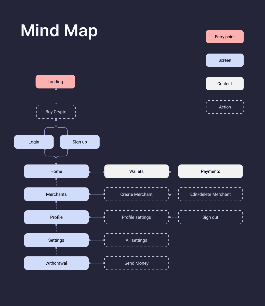
Through this process, I uncovered four major challenges that needed immediate attention.
Key Challenges Identified:


With these challenges mapped, it was clear that rebuilding the foundation was the first step towards solving system-wide issues.
With these challenges mapped, my first task was to establish a solid foundation that ensures structure, consistency, and scalability across TAMM’s design system. Without this, fixing individual components wouldn’t be effective in the long run.
To create a system that designers and developers could trust, I started by redefining its core building blocks.
Why focus on the foundation first?
A strong base ensures everyone — from designers to developers — speaks the same design language. Without it, component creation or scaling is impossible.
Core Foundations Established:

Core Color & Variables — Standardized color tokens with light/dark mode adaptability

Typography — Defined text styles with clear guidelines on font size, line height, weight, and usage.

Spacing & Radius — Built a consistent spacing scale with rem values and border-radius rules.
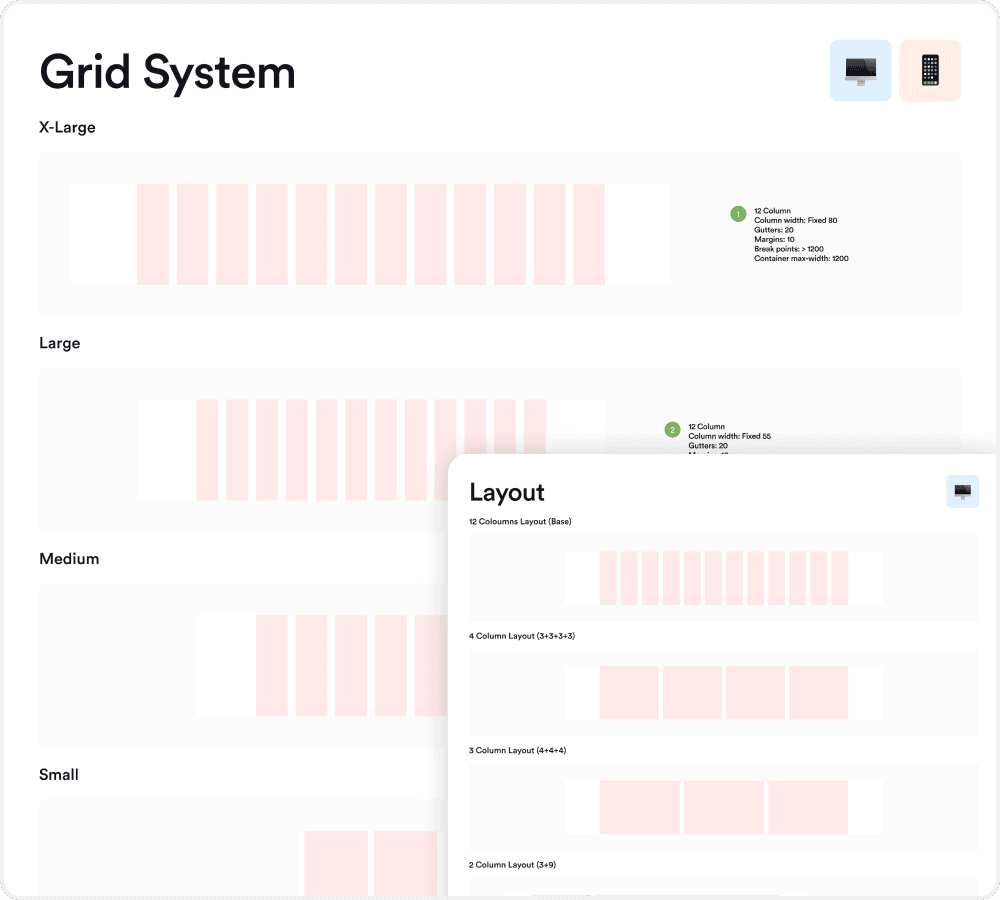
Grid System — Standardized grids for web, mobile, and conversational layouts ensuring responsive behavior.
After final reviews with design leaders and developers, these foundations were locked in. With this strong base, the next step was to revamp components for better usability and scalability.
With the foundation set, I moved to component creation—ensuring each component followed a structured, well-documented approach for consistency and scalability.
Why Standardized Documentation?
A well-documented component removes ambiguity, making it easier for designers and developers to collaborate, scale, and maintain the system efficiently.
To standardize this, we structured the documentation into key sections, making it easy for the team to understand and use.
Component Documentation Breakdown
1. Component Anatomy
✔️ Labeled anatomy with numbers, names, and supporting notes to guide design and development.
✔️ Clear guidelines and rules to ensure consistency and proper implementation.
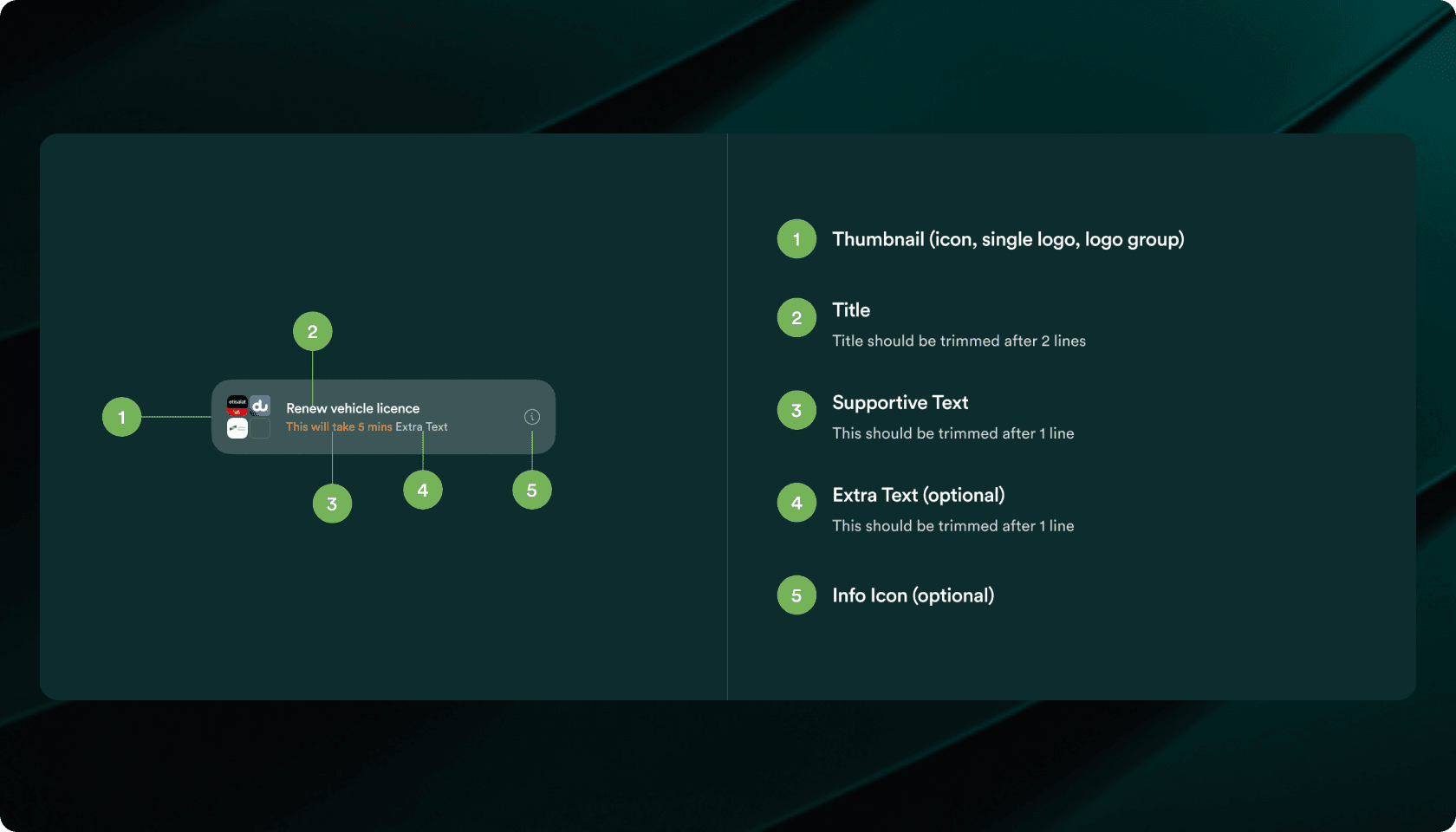
✔️ Defined all interaction states: Default, hover, active, disabled, loading
✔️ Ensured consistent behavior across different UI flows

✔️ Covered different sizes, layouts, and icon placements
✔️ Provided flexible options for multiple use cases

✔️ Included do’s & don’ts to guide designers and developers
✔️ Showcased best practices with supporting visuals

✔️ Real-world implementation of components across screens
Here, you can explore the complete component documentation in both Light and Dark modes, ensuring consistency across all TAMM components.
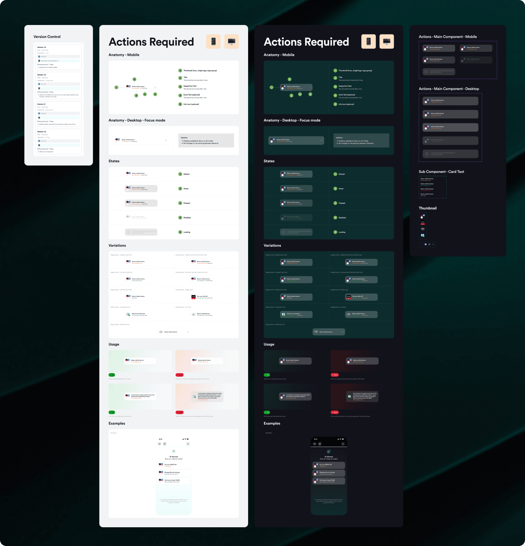
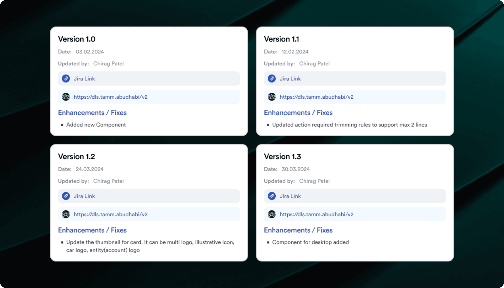
To maintain design consistency and traceability, every update was systematically tracked:
✔️ Version Number, Date, and Creator - Clear update history
✔️ JIRA Link - For development tracking
✔️ DLS Link - To check live implementation
✔️ Enhancement/Fixes Summary - Quick reference for changes
To future-proof TAMM 3.0, I built the Design System to support dark/light mode directly from Figma properties.

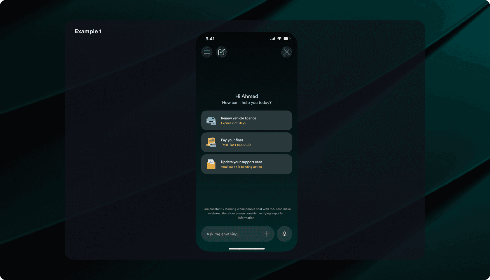
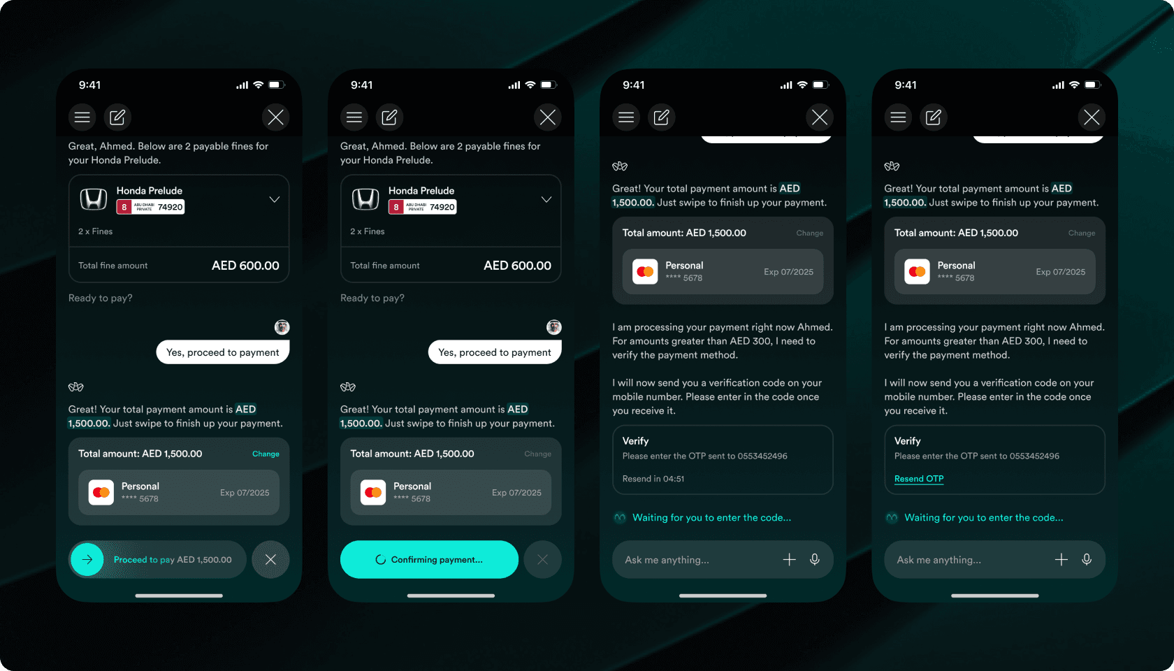
To showcase how the components came together, I created mobile screens reflecting the final design.
No more guesswork or endless clarifications. The new documentation acted as a single source of truth, ensuring developers had everything they needed upfront.
🔹 Interactive & Actionable - Developers could inspect components directly in Figma, with clear guidelines on states, behaviors, and constraints.
🔹 Tokenized & Scalable - Every component used design tokens, making development faster and more consistent.
🔹 No Surprises, No Delays - Regular design-dev syncs ensured smooth implementation without last-minute roadblocks.
💡 The Result? Fewer iterations, faster builds, and a truly collaborative workflow.
After launch, we tested the Design System with internal teams. The results spoke for themselves:
✔️ 80% More Consistent Designs – Unified UI across web and mobile.
✔️ 3x Faster Developer Handoff – Clear documentation & version control.
✔️ 2x Growth in Adoption – Increased usage across teams.
✔️ One-Click Dark/Light Mode – Enabled via Figma properties with zero extra design effort.
✔️ GITEX 2024 Success – Recognized as a game-changer at the global event.
✔️ Featured by Microsoft – Consider it done: How TAMM is transforming government services in Abu Dhabi with AI.
✔️ Government Recognition – Abu Dhabi Government showcased the revamp at GITEX Global 2024.
➡️ Foundations are non-negotiable for scalable design systems
➡️ Cross-functional workshops save rework time
➡️ Version control improves traceability and reduces risk
This project showed that a strong foundation with teamwork and clear documentation can turn a scattered library into a scalable and developer-friendly design system ready for a major launch.
Design systems aren’t just patterns - they’re the language teams speak to build better experiences. ✨